Analysing YouTube’s UI Interface
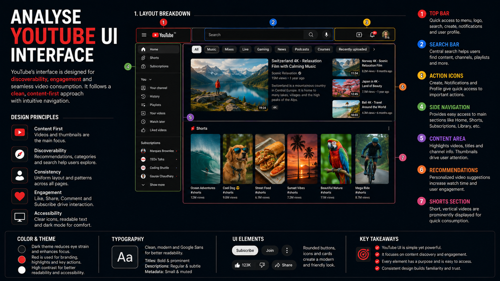
YouTube’s interface is a masterclass in balancing massive content volume with intuitive navigation. Its UI prioritizes discovery, personalization, and seamless playback—keeping users engaged while making core actions (search, upload, subscribe) instantly accessible.
Core Layout Structure
YouTube’s desktop and mobile layouts follow a consistent three-part structure:
-
Top navigation bar: Houses search, profile, notifications, and upload buttons.
-
Primary content area: Displays video thumbnails, titles, and metadata in a scrollable feed.
-
Side or bottom navigation: Desktop uses a left sidebar for Home, Trending, Subscriptions, and Library; mobile uses a bottom tab bar with 4–5 key destinations.
This separation ensures users always know where they are and how to move—critical for an app with billions of videos.
Visual Hierarchy and Clarity
YouTube excels at visual hierarchy. Thumbnail size, bold titles, and subtle metadata (views, upload time) guide attention without clutter. High-contrast text on light backgrounds ensures readability, while consistent spacing and alignment create rhythm across feeds.
Key UI principles at work:
-
Clarity: Icons and labels are familiar (e.g., magnifying glass for search, bell for notifications).
-
Consistency: Buttons, cards, and navigation behave the same across pages.
-
Feedback: Hover states, loading spinners, and “watched” indicators confirm user actions.
Personalization and Discovery
YouTube’s UI is deeply tied to its recommendation engine. The homepage dynamically surfaces videos based on watch history, subscriptions, and trending content—creating a “rabbit hole” effect that encourages prolonged viewing. Sections like “Up Next,” “Recommended,” and “Because you watched…” use algorithmic curation to keep users engaged.
This personalization is visible in the UI through:
-
Contextual headings: “Mixed for you,” “Trending now,” “From your subscriptions.”
-
Infinite scroll: Removes pagination barriers, encouraging continuous exploration.
-
Autoplay: Next video starts automatically, reducing friction between sessions.
Navigation Patterns
YouTube uses hybrid navigation:
-
Global nav: Bottom bar (mobile) or sidebar (desktop) for core sections.
-
Contextual nav: Video player overlays (like, share, save) and comment sections appear only when relevant.
-
Search-first design: Prominent search bar at the top supports queries, filters, and voice input.
Recent tests—like moving Subscriptions to a swipeable top tab—show YouTube’s willingness to iterate for faster feed switching, though such changes can disrupt muscle memory.
Accessibility and Responsiveness
YouTube maintains strong contrast ratios, readable fonts, and touch-friendly targets (48x48 px minimum). Keyboard navigation and ARIA labels support screen readers, while responsive layouts adapt seamlessly from mobile to 4K desktops.
Final Thought
YouTube’s UI succeeds because it treats interface as a conduit—not a destination. Every element serves discovery, playback, or navigation, with personalization and consistency at its core. For designers, it’s a benchmark in scaling complexity without sacrificing usability.