UI Design Principles: Core Fundamentals for Digital Interfaces
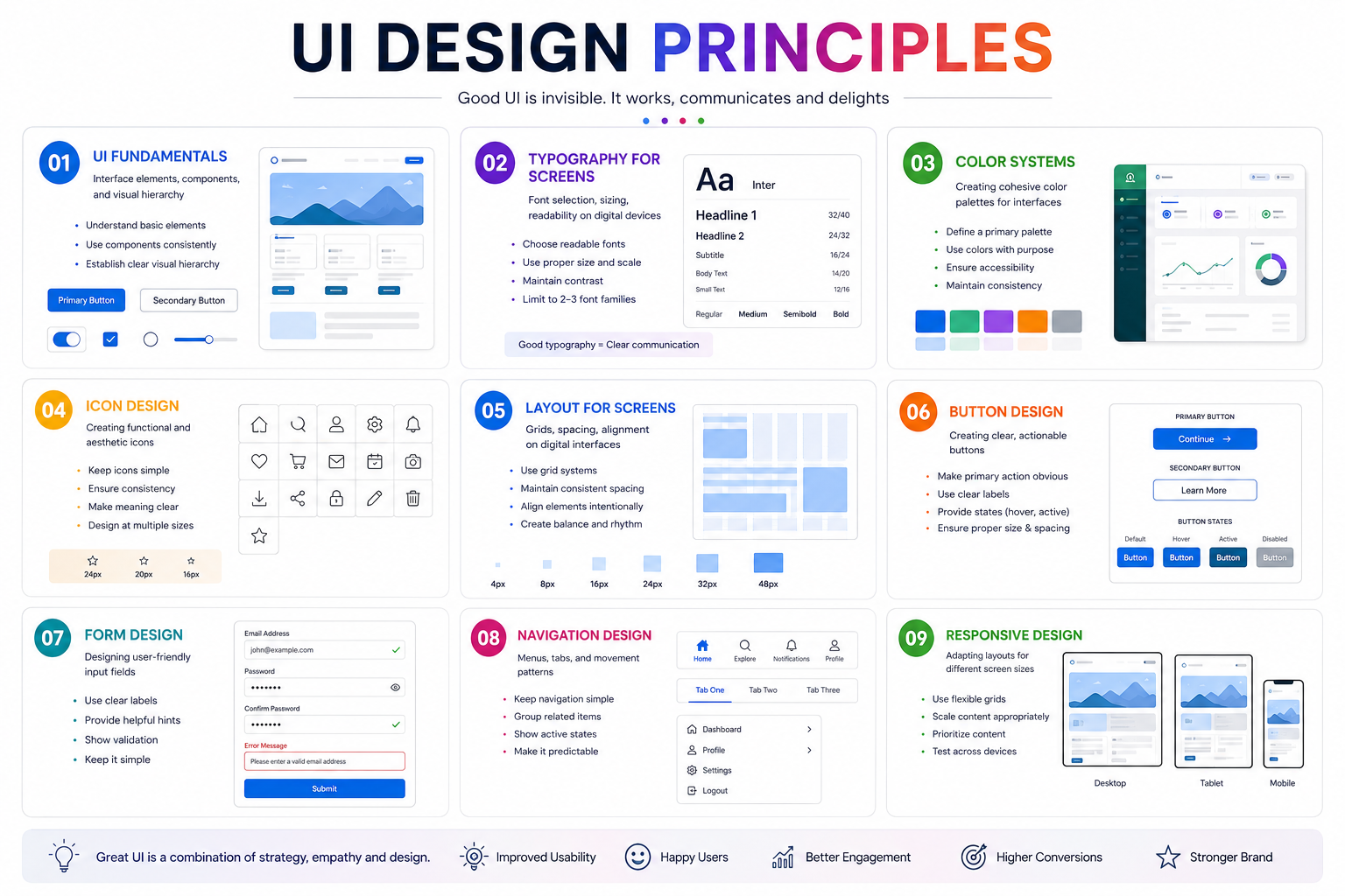
Great UI design balances aesthetics, clarity, and function. Whether you’re building a government e-service portal, a retail dashboard, or a multimedia app, these fundamentals ensure your interface is intuitive, accessible, and visually cohesive.
Interface Elements & Visual Hierarchy
UIs are built from components—buttons, cards, inputs, icons—that must be organized by importance. Visual hierarchy guides users’ attention using size, color, contrast, and spacing. Key tactics:
-
Size & weight: Larger, bolder elements signal priority.
-
Contrast: High-contrast colors draw focus to CTAs and key info.
-
Spacing: Group related items; separate unrelated ones.
Typography for Screens
Screen typography prioritizes readability across devices. Best practices:
-
Font choice: Sans-serif fonts (e.g., Inter, Roboto) offer clean, open letterforms ideal for screens.
-
Sizing: Body text 14–18 px; headings scaled proportionally.
-
Line metrics: Line height 1.4–1.6× font size; line length 45–75 characters.
-
Hierarchy: Limit to 2–3 fonts; use weight and size for distinction.
Color Systems
A structured color system ensures consistency and accessibility. Build in layers:
-
Primitive colors: Raw shades (e.g., 50–950 scales).
-
Semantic tokens: Purpose-based names like
color.text.primary. -
Component tokens: Optional, for mature systems (e.g.,
button.background.default).
Apply the 60-30-10 rule: 60% dominant, 30% secondary, 10% accent. Always test contrast ratios (4.5:1 for body text).
Icon Design
Icons should be functional first, aesthetic second. Use simple, recognizable shapes; maintain consistent stroke weight and size. Pair with labels when meaning isn’t universal.
Layout for Screens
Grids, spacing, and alignment create order. Use:
Button Design
Buttons must be clear and actionable. Make primary CTAs visually distinct with bold color, ample padding, and descriptive labels. Ensure touch targets are at least 48×48 px on mobile.
Form Design
Forms should minimize friction. Use:
Navigation Design
Navigation must be predictable. Use standard patterns: top bars for desktop, bottom tabs for mobile (3–5 items max). Highlight active states and provide breadcrumbs for deep hierarchies.
Responsive Design
Layouts must adapt seamlessly. Use fluid grids, relative units (%, rem), and breakpoints for mobile, tablet, and desktop. Test typography and touch targets across devices.
Final Thought
UI design is systematic. Master these fundamentals—hierarchy, typography, color, layout, and components—and you’ll build interfaces that are not only beautiful but also usable, accessible, and scalable across any digital product.