What Is a Grid System in Poster Design?
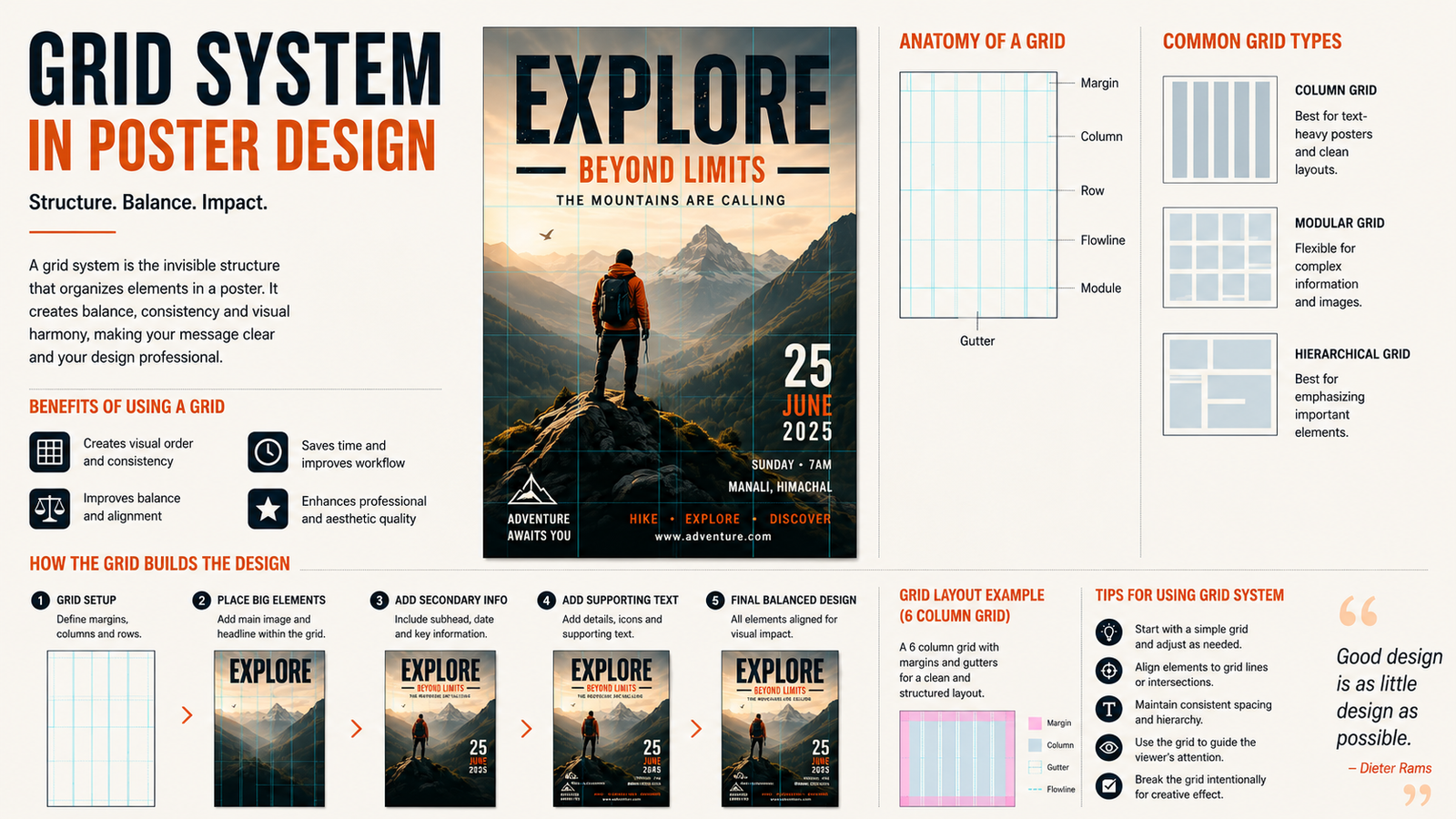
A grid system is an invisible framework of intersecting vertical and horizontal lines that organizes text, images, and whitespace on a poster. Think of it as scaffolding: you don’t see it in the final print, but it gives structure, alignment, and rhythm to every element. For content-heavy or information-driven posters—like event announcements, infographics, or government service notices—grids ensure clarity and visual balance.
Why Use a Grid for Posters?
Grids bring consistency, alignment, and hierarchy to your layout. They help you:
-
Align elements precisely, avoiding a cluttered or amateur look.
-
Create visual rhythm through repeated spacing and proportions.
-
Establish hierarchy by assigning key zones for headlines, images, and body text.
-
Speed up iteration, since you can quickly test variations within a fixed structure.
Even if you plan to “break the rules,” starting with a grid gives you a solid foundation to deviate from intentionally.
Core Components of a Poster Grid
Every grid consists of three basic parts:
-
Columns: Vertical divisions that guide placement of text and images.
-
Gutters: The space between columns, preventing elements from touching.
-
Margins: Outer edges that frame the entire design and provide breathing room.
Some grids also use modules (rectangular cells formed by intersecting rows and columns) and flowlines (horizontal guides) to further structure content.
Common Grid Types for Posters
-
Column Grids: Ideal for text-heavy posters. Use 2–4 columns to organize sections cleanly.
-
Modular Grids: Combine rows and columns into a matrix—great for schedules, data, or multi-image layouts.
-
Axial Grids: Built around a dominant horizontal, vertical, or diagonal axis that splits the poster into zones. Perfect for dynamic, typographic designs
-
Manuscript Grids: Single large content area, suited for minimalist posters with one focal image or message.
How to Build a Poster Grid (Step-by-Step)
-
Define your content: List all elements—headline, subhead, body, images, logo, date/time.
-
Sketch a rough layout: Block out zones for each element to estimate proportions.
-
Set up your canvas: Choose poster size (e.g., A2, A1, A0) and orientation.
-
Create guides: In tools like Illustrator, InDesign, or Figma, draw lines for columns, gutters, and margins. Convert strokes to guides for non-printing references.
-
Place content: Align headlines to column edges, images to modules, and body text within defined widths for readability.
-
Refine and break: Adjust spacing, scale, or alignment—but keep the grid as your anchor.
Pro Tips for Effective Grid Use
-
Start simple: A 3-column or 4-column grid works for most posters.
-
Use consistent gutters: 10–20 px (or proportional to canvas) keeps spacing uniform.
-
Prioritize readability: Keep line lengths under 60 characters for body text.
-
Leverage whitespace: Let margins and gutters breathe—don’t fill every module.
-
Test at scale: Zoom out to 25% to check overall balance before finalising.
Final Thought
A grid system isn’t a constraint—it’s a creative catalyst. Whether you’re designing a retail promotion poster, a government e-service awareness campaign, or an event flyer, a well-constructed grid ensures your message is clear, professional, and visually compelling. Start with structure, then let your creativity flow within—and sometimes beyond—it.