What Is Contrast Ratio?
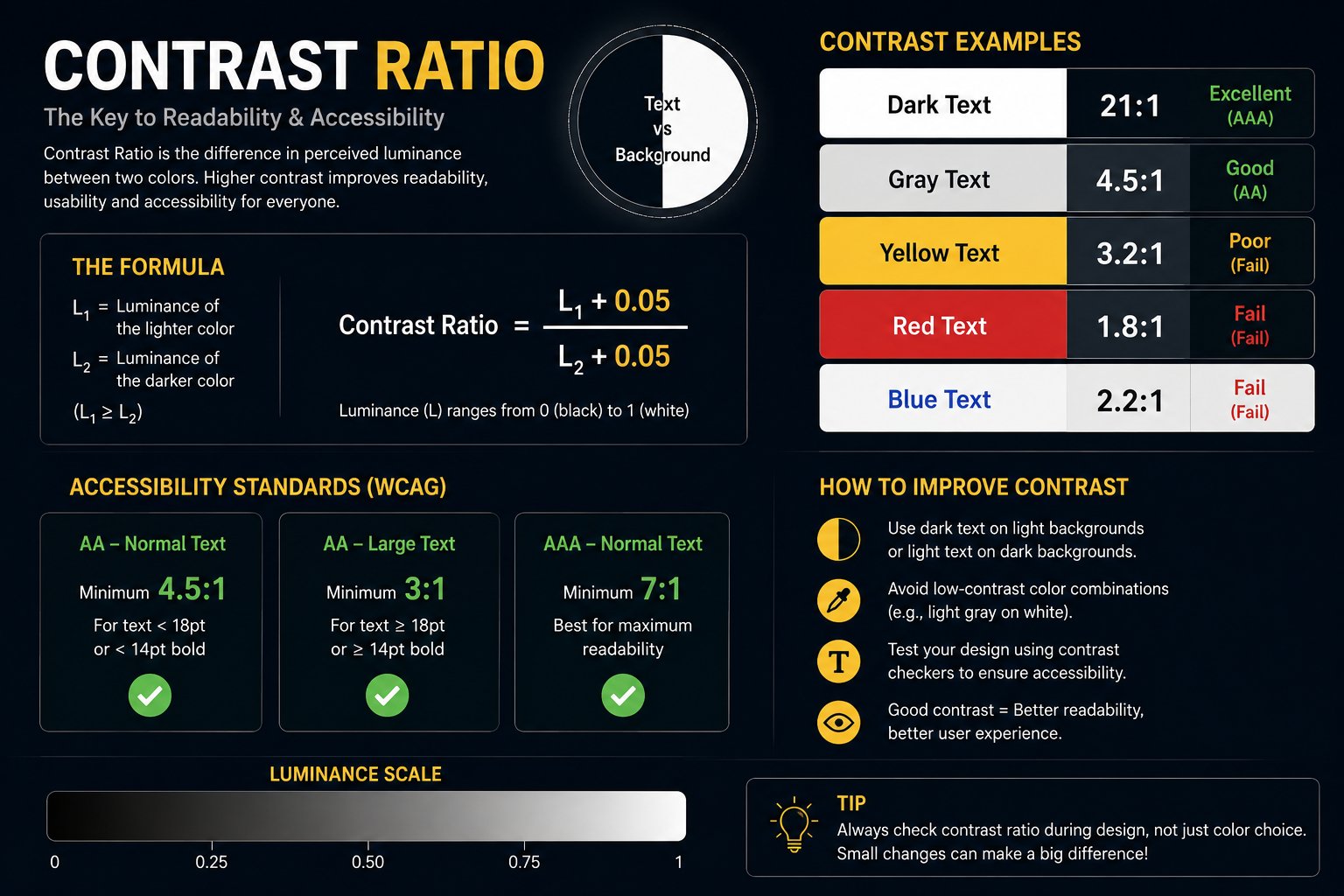
Contrast ratio measures the difference in brightness between foreground (usually text) and background colors. It is expressed as a ratio from 1:1 (no difference, e.g., white on white) to 21:1 (maximum difference, e.g., black on white). Higher ratios mean better legibility, especially for people with low vision, color blindness, or when viewing screens in bright environments.
Why Contrast Ratio Matters
Good contrast is essential for readability and accessibility. Insufficient contrast makes text hard to read, increases eye strain, and can exclude users with visual impairments. For blogs, dashboards, and government portals—where clarity and inclusivity are critical—maintaining proper contrast ensures content is usable by the widest possible audience.
WCAG Standards for Contrast
The Web Content Accessibility Guidelines (WCAG) define minimum contrast requirements to ensure digital content is accessible:
-
Normal text (below 18pt or 14pt bold): minimum 4.5:1 contrast ratio
-
Large text (18pt+ or 14pt+ bold): minimum 3:1 contrast ratio
-
Incidental or decorative text, and logos: no contrast requirement
These thresholds align with international standards like ISO-9241-3 and ANSI-HFES-100-1988, which also recommend 3:1 as a baseline for standard text under typical viewing conditions.
How Contrast Ratio Is Calculated
Contrast ratio is based on relative luminance—a measure of perceived brightness. The formula is:
Where is the luminance of the lighter color and is the luminance of the darker color. Tools like WebAIM’s Contrast Checker or browser dev tools (e.g., Lighthouse) automate this by accepting hex codes and returning the ratio instantly.
Practical Tips for Blog Design
-
Start with high-contrast pairs: Black text on white background gives 21:1—ideal for body copy.
-
Test early and often: Use accessibility checkers during design (Figma plugins) and development (browser audits).
-
Don’t rely on color alone: Combine contrast with font weight, size, and spacing for clarity.
-
Large headings can be slightly lower contrast: Since they’re easier to read, 3:1 is acceptable for titles and banners.
-
Avoid light gray on white: Common in “subtle” UIs but often fails 4.5:1 for body text.
Tools to Check Contrast
-
WebAIM Contrast Checker: Enter foreground/background hex codes for instant ratio and pass/fail status.
-
Figma Plugins: “Contrast”, “A11y – Color Contrast Checker” for design-stage validation.
-
Browser DevTools: Chrome’s Lighthouse audit flags low-contrast elements automatically.
Final Thought
Contrast ratio isn’t just a technical metric—it’s a commitment to inclusive communication. Whether you’re designing a government e-service portal, a retail packaging label, or a blog post, ensuring sufficient contrast makes your content clearer, more professional, and accessible to everyone. Aim for at least 4.5:1 for body text, and you’ll meet WCAG AA standards while improving user experience across devices and abilities.