Learning Gestalt Principles and Heuristic Evaluation
Gestalt principles and heuristic evaluation are two foundational pillars of effective UI/UX design—one explains how users perceive visual information, and the other provides a framework to assess usability. Mastering both equips designers to create interfaces that are not only visually coherent but also functionally intuitive.
What Are Gestalt Principles?
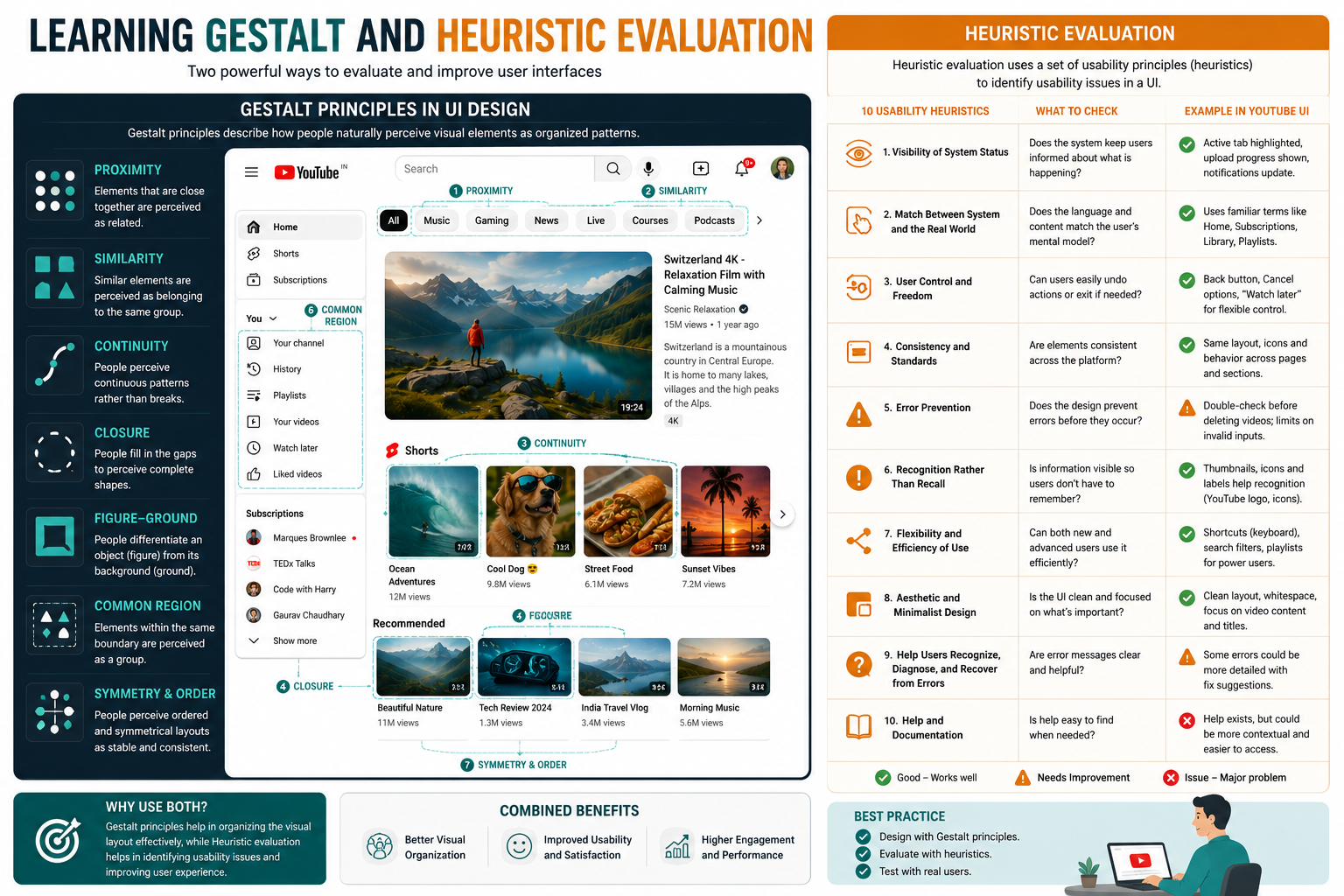
Gestalt principles are psychological theories describing how humans naturally organize visual elements into unified wholes. Rather than seeing isolated parts, our brains group, simplify, and interpret patterns based on innate tendencies. Key principles include:
-
Proximity: Elements close together are perceived as related.
-
Similarity: Items sharing color, shape, or size are seen as belonging to the same group.
-
Closure: The brain fills in missing parts to perceive complete shapes.
-
Continuity: Eyes follow smooth, continuous lines or paths.
-
Figure/Ground: We distinguish focal objects from their background.
-
Common Region: Elements within a shared boundary are grouped together.
In UI design, these principles guide layout, grouping, and hierarchy—ensuring users instantly understand relationships between buttons, cards, and sections.
What Is Heuristic Evaluation?
Heuristic evaluation is a usability inspection method where experts review an interface against established usability principles—called heuristics—to identify potential issues. Jakob Nielsen’s 10 heuristics are the industry standard:
-
Visibility of system status
-
Match between system and real world
-
User control and freedom
-
Consistency and standards
-
Error prevention
-
Recognition rather than recall
-
Flexibility and efficiency of use
-
Aesthetic and minimalist design
-
Help users recognize, diagnose, and recover from errors
-
Help and documentation
Evaluators (ideally 3–5) independently assess the interface, rate issues by severity (0–4), and consolidate findings into actionable recommendations.
How Gestalt and Heuristics Work Together
Gestalt principles inform the “why” behind visual perception, while heuristics provide the “how” for usability validation. For example:
-
Proximity + Consistency: Grouping related form fields (Gestalt) aligns with Nielsen’s “Consistency and standards” heuristic.
-
Similarity + Recognition: Using consistent icon styles (Gestalt) supports “Recognition rather than recall.”
-
Figure/Ground + Minimalism: Clear visual hierarchy (Gestalt) reinforces “Aesthetic and minimalist design.”
Research shows that linking Gestalt laws to Nielsen’s heuristics improves learnability, efficiency, and overall user satisfaction—especially in mobile interfaces.
How to Learn Both Effectively
-
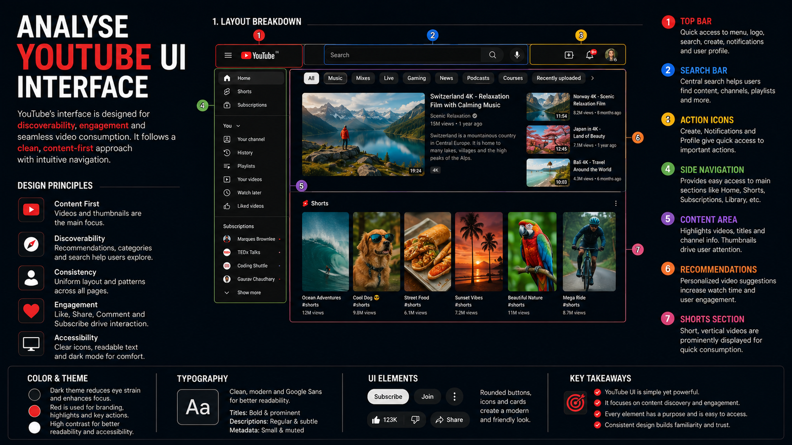
Study Gestalt visually: Analyze real UIs (e.g., YouTube, government portals) and label which principles are at play.
-
Practice heuristic audits: Pick an app or website and evaluate it using Nielsen’s 10 heuristics. Document issues with screenshots and severity ratings.
-
Combine both: After a Gestalt analysis, run a heuristic evaluation to see how perception aligns with usability.
-
Use templates: Free heuristic evaluation templates (with severity scales and task lists) streamline the process.
Final Thought
Gestalt principles help you design interfaces that feel natural; heuristic evaluation ensures they work reliably. Together, they form a powerful toolkit for creating digital products—whether e-service portals, retail packaging infographics, or multimedia dashboards—that are both beautiful and usable.